Resume Font Size, Margins, and Spacing: The Settings That Keep a Resume Readable
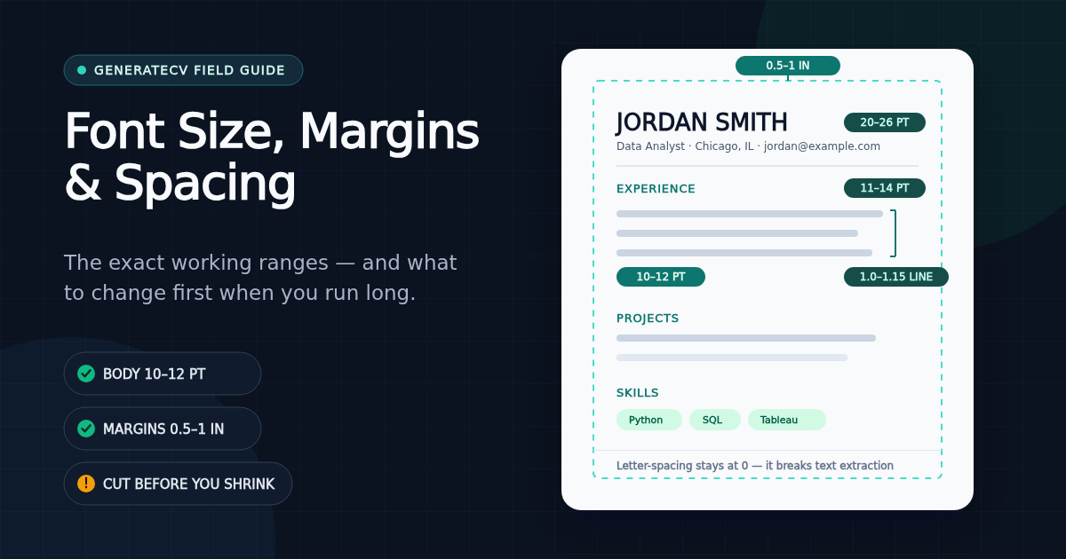
Exact working ranges — body 10–12pt, name 20–26pt, margins 0.5–1 inch, line spacing 1.0–1.15 — plus the change-this-first order for a resume that runs slightly long, and the one typography trick our extraction tests prove you should never use.
Key takeaways
- Working ranges: body 10–12pt, section headings 11–14pt, your name 20–26pt, margins 0.5–1 inch, line spacing 1.0–1.15 inside entries with clear space between sections.
- When a resume runs slightly long, change settings in a fixed order: cut content first, then inter-section spacing, then margins, then body size — and stop at 10pt and half-inch margins.
- Never compress or stretch with letter-spacing: our own extraction tests show wide tracking corrupts the PDF text layer, turning headings into unsearchable letter soup.
- There is no 'ATS-approved font' list. Font choice is a readability decision for humans; extraction problems come from decorative glyphs and spacing, not from Calibri versus Georgia.
- Assume the first read happens on a phone: dense, small, margin-less pages punish exactly the skim that decides whether you get a longer look.
Set resume body text at 10–12pt, section headings at 11–14pt, your name at 20–26pt, margins between 0.5 and 1 inch, and line spacing at 1.0–1.15 within entries with visible space between sections. If you're fighting for room, cut content before you shrink anything — and never go below 10pt body or half-inch margins. Those are the numbers; here's the reasoning, and the order to adjust them in.
The settings, with working ranges
| Setting | Working range | Notes |
|---|---|---|
| Body text | 10–12pt | 10pt is the floor, not the target; 10.5–11pt reads comfortably for most fonts |
| Section headings | 11–14pt (or body size, bold/caps) | Hierarchy can come from weight and spacing instead of size |
| Your name | 20–26pt | The one place display size belongs; contact line stays small (9–10pt) |
| Margins | 0.5–1 inch all sides | Symmetric; 0.6–0.7" is a fine compromise when space is tight |
| Line spacing (within entries) | 1.0–1.15 | Bullets tolerate tighter spacing than paragraphs |
| Space between sections | Noticeably more than within them | Grouping is what makes a skim work; don't equalize all gaps |
| Letter-spacing (tracking) | Leave it alone | See below — this one breaks text extraction, not just aesthetics |
These ranges match what institutional reviewers actually ask for: MIT's career office, for instance, specifies a conservative font "no smaller than 10pt" with "at least half inch margins on all sides."
What we actually ship (so you can check our homework)
Rather than tell you our exports are "optimized," here are the real defaults from our primary PDF template's source code: 10pt body text, 9pt for metadata lines, 26pt name, 36pt page padding — exactly half an inch — and 1.35 line height on bullets, which lands the visual rhythm near the top of the ranges above once inter-section spacing is counted. Density, line height, and margins are exposed as adjustable scales in the builder rather than fixed values, because the right density genuinely differs between a 400-word early-career resume and a packed two-pager.
Running long? Change things in this order
A resume that's one page plus four lines — or two pages plus a paragraph — should be fixed in a specific sequence, most effective and least damaging first:
- Cut content. This fixes more overflow than every layout trick combined, and it makes the resume better instead of smaller. The concrete editing rules are in how long should a resume be.
- Tighten space between sections — before touching line spacing inside entries. Grouping survives; readability inside bullets is untouched.
- Bring margins down toward 0.6". From a 1-inch start, that recovers roughly a bullet's worth of lines per page without visibly crowding the edges.
- Step body text down by half-points — 11 to 10.5 to 10 — checking a printed or zoomed-out view at each step.
- Stop. Below 10pt body or half-inch margins, you're signaling "couldn't edit" to every reader. Go back to step 1.
The trick that breaks extraction: letter-spacing
One typography adjustment deserves a hard warning, because it damages something invisible. Stretching headings with wide letter-spacing (tracking) can corrupt the PDF's text layer: past a threshold, the extracted text of "EXPERIENCE" becomes "E X P E R I E N C E" — a string no keyword search matches. This isn't speculation; it's why we measured the exact threshold and our export tests now fail the build if any shipped template exceeds one point of letter-spacing — at two points, the same automated test demonstrably loses the word. If you want the spread-out heading look, use a template that fakes it safely (small caps, weight, size) rather than cranking tracking in a word processor.
Font myths, briefly
There is no list of "ATS-approved fonts," no matter how confidently a blog asserts one. Parsers read the text layer of your file; whether that text rendered in Calibri or Georgia is irrelevant to extraction in any mainstream system's documented parsing behavior. Font choice is a human readability decision: pick something standard and unremarkable, in the ranges above, and spend your optimization effort on content. The genuine glyph-level risks — decorative icon fonts, ligature-heavy display faces, symbol bullets — are covered in the format guide; ordinary text fonts aren't among them.
Design for the phone skim
Recruiters increasingly do their first pass on a phone — mail attachments, ATS mobile views, a link opened between meetings. That first read is zoomed out and fast. Dense 9pt text with hairline margins becomes a gray wall at phone size; 10.5pt body with real section gaps stays scannable. If you build on a phone yourself, the same logic applies in reverse — our mobile resume guide covers that workflow. Accessibility points the same direction: comfortable sizes, honest contrast (dark text on white — save the grays for metadata), and structure that survives being read aloud or zoomed are good for every reader, not just edge cases.
Sources and testing notes
- MIT Career Advising & Professional Development: Resumes — 10pt minimum font and half-inch minimum margins; checked August 2, 2026.
- GenerateCV template defaults (10pt body, 26pt name, 36pt page padding, 1.35 bullet line height) are read directly from our production PDF template source; the letter-spacing findings come from our automated extraction tests, which render headings with React-PDF, extract them with pdf.js, and enforce a one-point cap across every shipped template. Method and limitations: the PDF text-layer experiment.
- The working ranges themselves are editorial recommendations — typography conventions, not measured hiring outcomes — aligned with institutional guidance where it exists.
Check your resume free — no signup
See how your resume scores against real ATS filters in seconds.
Related Articles
The Resume Bullet Formula: 105 Weak-to-Strong Examples
Turn duty statements into specific resume bullets with a repeatable action, scope, result, and method formula, plus 105 worked examples across 35 roles.
Read articleResume Summary Examples That Survive the Skim
Write a specific professional summary with a target role, relevant scope, strongest proof, and fit, using 35 before-and-after examples across ten role families.
Read articleHow Long Should a Resume Be? One Page, Two Pages, or More
One page is the right default for most people early in a career; two pages are earned by roughly a decade of relevant work. What changed in 2026: federal resumes are now capped at two pages — and the internet is still full of advice telling you to write five.
Read article